The Apostol book from the museum collection was created at the Moscow Print Yard in 1635. By that time, the printing house had already been operating for 82 years — it opened in the reign of Ivan the Terrible. The first book with the information about the publishing house and the time of publishing was also the Apostol — the copy is dated 1564.
The Apostol is the most important church book that is read in the divine services. The book includes two parts of the New Testament: the Acts and the Epistles of the Apostles. The first part is devoted to the life of Christ’s disciples after his crucifixion; it is written in the form of a historical chronicle with many characters. The Book of Acts is believed to have been written by Luke the Evangelist. The second part contains the texts in which the Apostles instruct the first Christians.
Since priests had to be able find the necessary fragments quickly, the Apostol was divided into “periscopes” — special sets of verses for different services. They usually begin with the words “Brethren” or with an appeal to a specific Christian by name: for example, “son Timothy”, “son Tit” and others.
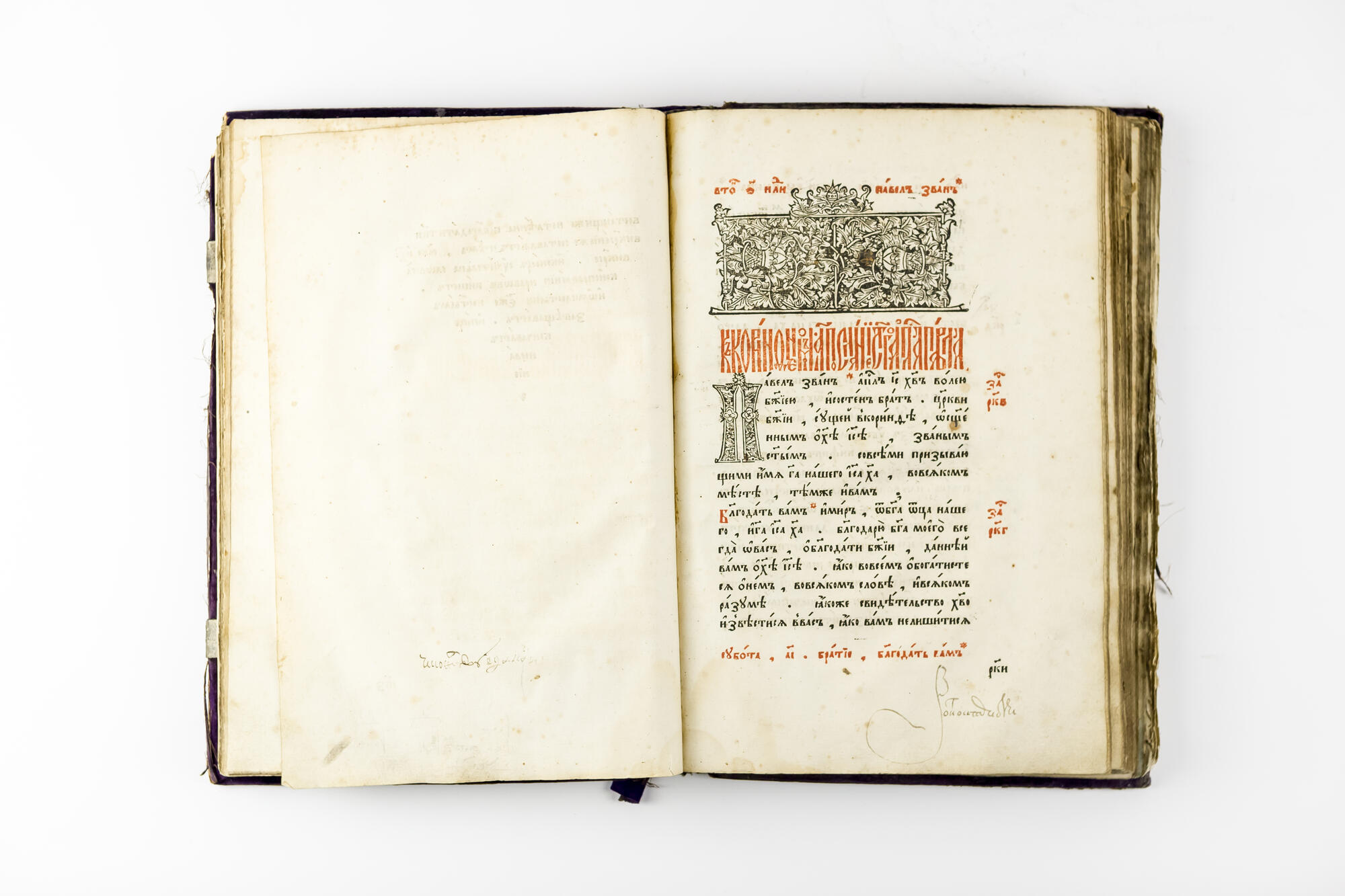
The book from the museum collection is open on the page with the First Letter of Paul to the Corinthians. Above the text is the decorated border — a miniature ornamental composition. It highlights the beginning of each section.
The pattern of headpiece borders had been changing over the period from the 11th to the 18th centuries. In this book, the printers chose the Old Byzantine style. According to this style, accompanying decorated borders were drawn within clear frames. The frames could be in the form of a long rectangle, a square, the letter “П” or resemble the cross-section of a temple. The inner part of the decoration was usually filled with the simplest geometric shapes: circles, rectangles, triangles, and rhombuses with realistically depicted flowers and leaves inside. An indispensable motif of this ornament is the Byzantine flower “krin” (a trefoil).
In this printed copy of the book, the artisans paid great attention to the initial: it was quite large and stylized to look like “vyaz”, a type of ancient decorative Cyrillic lettering, in which letters were linked into a continuous ornament. The term “initial” comes from the Latin “initialis”. This is the name of the capital letter at the beginning of a book, chapter, or paragraph that is larger than the rest of the text. In the Russian tradition, the initial is most often referred to as a drop cap. A drop cap can be in the form of a font type or decorated, monochrome or colored, but the execution style is not so important — its main purpose is to draw the reader’s attention to the beginning of the text.
The Apostol is the most important church book that is read in the divine services. The book includes two parts of the New Testament: the Acts and the Epistles of the Apostles. The first part is devoted to the life of Christ’s disciples after his crucifixion; it is written in the form of a historical chronicle with many characters. The Book of Acts is believed to have been written by Luke the Evangelist. The second part contains the texts in which the Apostles instruct the first Christians.
Since priests had to be able find the necessary fragments quickly, the Apostol was divided into “periscopes” — special sets of verses for different services. They usually begin with the words “Brethren” or with an appeal to a specific Christian by name: for example, “son Timothy”, “son Tit” and others.
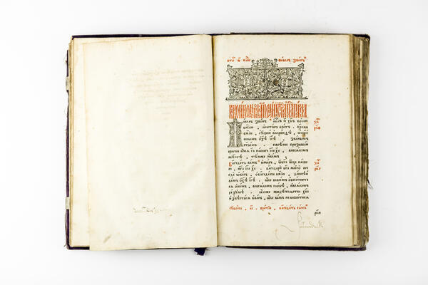
The book from the museum collection is open on the page with the First Letter of Paul to the Corinthians. Above the text is the decorated border — a miniature ornamental composition. It highlights the beginning of each section.
The pattern of headpiece borders had been changing over the period from the 11th to the 18th centuries. In this book, the printers chose the Old Byzantine style. According to this style, accompanying decorated borders were drawn within clear frames. The frames could be in the form of a long rectangle, a square, the letter “П” or resemble the cross-section of a temple. The inner part of the decoration was usually filled with the simplest geometric shapes: circles, rectangles, triangles, and rhombuses with realistically depicted flowers and leaves inside. An indispensable motif of this ornament is the Byzantine flower “krin” (a trefoil).
In this printed copy of the book, the artisans paid great attention to the initial: it was quite large and stylized to look like “vyaz”, a type of ancient decorative Cyrillic lettering, in which letters were linked into a continuous ornament. The term “initial” comes from the Latin “initialis”. This is the name of the capital letter at the beginning of a book, chapter, or paragraph that is larger than the rest of the text. In the Russian tradition, the initial is most often referred to as a drop cap. A drop cap can be in the form of a font type or decorated, monochrome or colored, but the execution style is not so important — its main purpose is to draw the reader’s attention to the beginning of the text.

